Store Setup Success: The Best Layouts, Custom Signage and Display Tips for Retail
Posted by Half Price Banners on Oct 21st 2019

Whether you are planning on opening a new store or redesigning an existing one, there is a lot to consider to ensure you are creating an environment that captures your customers’ attention and influences the customer experience in a positive way. Planning the layout, design and displays of your store is both an art and a science, requiring creativity, an understanding of your customers and their habits and a lot of trial and error. In this article, we’ll take a look at some of the effective layouts, tips for creating compelling signage for your store, guidelines for displaying your merchandise and more!
Store Layouts
The purpose of a store layout is to help guide customers through the store and expose them to your products. It is a strategic use of space that’s intended to influence a customer’s experience and encourage purchasing behaviors. Store layouts have two important components:
- Design—This includes the use of strategic floor plans and space management, including furniture, fixtures, lighting, displays and signage.
- Customer flow—This describes a customer’s pattern of behavior and method of navigating through a store. Understanding how customers move through a store and how they interact with merchandise based on the store’s layout is critical to a successful store management strategy.

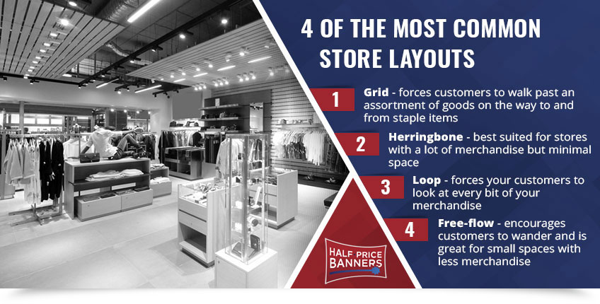
Four of the most common store layouts include:
- Grid—You’re probably familiar with this layout as it is commonly used in stores with a lot of merchandise and product variation, such as grocery stores, convenience stores and pharmacies. The grid features long aisles with impulse purchase/grab-and-go items near the front and staple items at the back. This layout forces customers to walk past an assortment of goods on the way to and from the necessary staple items that they needed in the first place, encouraging customers to purchase more.
- Herringbone—If the grid sounds like the ideal layout for your merchandise, but your retail space is long and narrow, then you may want to consider the herringbone layout. This layout offers many of the same advantages of the grid but is best suited for stores with a lot of merchandise but minimal space like book shops, community libraries and small hardware stores.
- Loop—The loop layout (also known as the “racetrack” layout) creates a deliberate look that guides customers from the front of the store, past all of your merchandise, and then leads them to the check-out line. This layout forces your customers to look at every bit of your merchandise and entices impulse purchases in the same manner as the grid does.
- Free-flow—Unlike the other store layouts, free-flow layouts make no attempt to force customers through a specific pathway to view their merchandise. Instead, this type of layout encourages customers to wander and is great for small spaces with less merchandise.

When it comes to deciding on a layout for your store, it’s important to consider your products, desired customer behavior and the amount of space you have available.
Custom Signage for Your Store
Owning and running your own store means you will need to invest in custom signage to promote your business. Whether your store is in a busy shopping center or tucked away on a quiet street, the right signage can attract customers to your location and help them find their way around your store once inside. For example, you can increase foot traffic to your store with a compelling A-frame sign displayed outside, capture the attention of passersby by utilizing window signs or hang signs to guide customers through your store to help them find a specific product. No matter what type of signage you need for your store or how you plan to use it, it’s important to ensure your signs are well-designed and have a clear message for your customers.
Let’s take a look at some tips for creating effective signage for your store:
- Use Compelling Colors—When it comes to well-designed signage, your choice of colors is crucial. Use vibrant, eye-catching colors that attract attention but also convey your brand.
- Be Short and Concise—Studies have shown that humans’ attention spans are getting shorter. As a store owner, this means that you need to be able to quickly capture your customers’ attention and keep it long enough to get your message across. When designing signage for your store, keep your messaging short, sweet and to the point.
- Make it Readable—Your signage should be easy to read, whether viewed up close or from a distance. This means using fonts that are large enough to see in simple styles and colors, rather than complicated color schemes and tiny, stylistic fonts. It’s also important to remember that less is more when it comes to designing effective signage. If a customer can’t quickly and clearly read your sign, they will likely move on and you may lose that opportunity.
- State Each Sign’s Purpose—Each sign you display in your store should have a clearly stated purpose. This is especially important for any signs you display that promote a specific product. Customers want to know why they should buy the product you’re promoting, and it’s your job to tell them that.

Custom signage is crucial to the success of any store. Well-designed signs can convince customers to visit your store and make a purchase, as well as improve your customers’ experience and enhance your brand.
Displaying Your Merchandise
Your store is your most effective salesperson and how you choose to maximize this space and display your merchandise is key when it comes to the experience of your customers, their purchasing habits and your store’s success. Visual merchandising is the practice of displaying your merchandise in a manner that helps customers find what they’re looking for and encourages larger purchases. This process involves a lot more than just setting up and stocking shelves with your products. It combines an effective, well-thought-out layout with strategically placed displays in order to maximize sales and provide your customers with a positive shopping experience.
We discussed the most common types of store layouts used by retailers and how to determine the right layout to use earlier in this article. Once you know which layout you want to use, you can begin planning how you want to display your products. Here are a few tips for displaying your merchandise in a way that makes it easier for your customers to find the products they want while encouraging them to purchase other products they may not have necessarily needed, but couldn’t pass up nonetheless:

- Display Necessary Items in the Back—This will force your customers to walk past the rest of your merchandising areas on their way to pick up milk, toilet paper, bread and other staples. You will find that customers almost always pick up an extra item or two that they forgot to put on their list or didn’t realize they needed until they saw it.
- Be Strategic with High-Margin Items—By strategically placing high-margin items along the way to the staple items in the back of your store, you’re encouraging customers to make extra purchases, which translates to extra sales!
- Keep General Merchandise and Grocery Items Separate—Always keep general merchandise and grocery items in separate locations in your store. This allows customers to become more familiar with where products are located and helps to keep things consistent. A good strategy is to organize your store into departments and categories.
- Place Seasonal and High-Margin Items in Front—Give seasonal items and small, high-margin items like gum, candy or accessories their best chance to sell by keeping them in the front of your store. Otherwise, you could be stuck with out-of-season stock that you will have to mark down to sell and expired items that you won’t be able to sell at all.
- Look to the Right—Did you know that the right side of the store after the entrance is the most common direction customers turn? That makes that space one of the most prime locations for merchandising. Make sure to place high-margin, high-consumable products in these areas to encourage customers to buy.
- Avoid Displaying High-Theft Items in the Back—The back of your store is where thefts are most likely to occur because these areas are the most concealed. Because of this, it’s important that you keep commonly stolen items, such as cosmetics, alcohol and baby formula, closer to the front of the store and in areas that can be easily seen from multiple locations in your store. Always make sure that you have a clear view from the front of the store to the back, and for your added security, have cameras installed.

Displaying your merchandise in a way that makes sense and catches your customers’ attention can be a challenging task and may require a little bit of trial and error to determine the most effective and efficient setup. Remember to be strategic when displaying your products, keep your merchandise consistently grouped throughout your store and keep staples in the back while high-margin items should be in the front.
If you’re in the process of opening a store, turn to Half Price Banners. We won’t be able to assist you with choosing the best layouts for your store—that’s for you to determine—but we can help you create signage for your business. We are proud to provide our customers with custom banners and signs made from the highest-quality materials in the industry. No matter what your signage needs may be, we’ve got you covered. Best of all, if you need help coming up with a design for your signage, we have a team of experienced designers who are ready to help. Contact us today or give us a call at (866) 468-0490 to get started.

