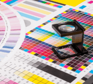
Banner Ink Color Theory
Posted by Half Price Banners on Oct 3rd 2014
Color – where to begin?
So many colors, so little time.
I will start off with a little information on how banner colors work.
There are two theories when it comes to working with color: the additive and subtractive color theories.
In the additive color theory, you combine together Red, Green, and Blue Light to get pure White light. This is what you see when looking at your computer monitor, TV, or a movie screen. This is commonly referred to as RGB color mode in design software. Every color that the human eye can see can be reproduced by mixing Red, Green, and Blue light.
In the Subtractive color theory, you start with a white surface and use ink to remove light reflecting off of it.
Let’s say you start with a white sheet of paper and cover it with Cyan (C) ink. What you would actually be looking at is the white light reflecting off the paper minus all of the red light, which has been absorbed by the Cyan ink. If you take the same white sheet and cover it with Cyan, Magenta (M), and Yellow (Y), in theory you would have a black sheet of paper. In reality it would be a dark gray, which is why printers add Black (K) ink to the mix.
This is why this color mode is often called CMYK in your designing software.
Ninety to ninety-five percent of all the colors you can see can be reproduced using Cyan, Magenta, Yellow, and Black inks.
Spot and Pantone colors are a whole other ball of wax. Let’s say you want Pantone color 287, which is a standard blue. If your printer uses the Pantone matching system, they would go to a shelf, pick up a can of Pantone 287, and print you art with it. If your printer does not use the Pantone system, then they would use their design software to break down Pantone color 287 into its CMYK parts: C=100, M=83, Y=16, K=6. Keep in mind about 90% of all Pantone colors can be accurately reproduced in CMYK format.
Now on the colors that would look good on a banner: Let’s start with high-visibility black text on a white background. You can’t beat a classic.
Some other good color combos are black/yellow and red/white. Red and yellow can also look very good. Basically, you want a high contrast between your text and background colors. Contrast is the difference between your lightest and darkest color.
Some color combos to avoid on your banner:
Red text on a black background – even a bright “fire engine” red can be hard to read on a black background, or vice versa.
Bright blue and bright red – lots of blue text on a red background, or vice versa, can give people eye strain and headaches.
Join us next time for How to store your banner.

